
Challenge
The client, a UK-based student recruitment company, organized in-person events across Indian cities to connect universities with prospective master’s and MBA students.
Despite strong interest, two major issues were affecting both student satisfaction and event performance:
A long registration form
The client’s contracts required detailed student information at the registration stage (academic background, target countries, course preferences, budgets, and more).
The existing form was lengthy, felt transactional, and was often completed on mobile. Many students dropped off midway, felt fatigued, or postponed filling it out, leading to:Lower overall registrations
Incomplete or poor-quality data
A perception that the organization was “asking too much” upfront
Low registration-to-attendance conversion
Even among those who did register, a smaller-than-expected proportion actually showed up for the events.
Key issues included:Limited communication post-registration (few reminders, generic messaging)
Weak emotional connection with students; events felt like “just another fair”
Operational friction: some venues were hard to access, check-ins were slow, and the experience on the day lacked warmth and comfort
These factors reduced attendance numbers, impacted university satisfaction, and made it harder for the client to secure repeat business from partner institutions.
Solution
We focused on two core levers: transforming the registration experience into a student-friendly journey and strengthening communication and on-ground experience to encourage attendance.
Making registration enjoyable and meaningful
Instead of treating the long form as a “necessary evil,” we redesigned the journey to help students understand why their information mattered and how it benefited them.
Key changes included:
Breaking the form into friendly, digestible sections with clear progress indicators, so students never felt overwhelmed at any point.
Rewriting form copy to be conversational and supportive, explaining how details like academic history and course preferences would help match them to relevant universities, scholarships, and sessions.
Optimizing the form for mobile, with fewer taps, smarter dropdowns, and pre-filled defaults wherever possible to reduce effort.
Incorporating micro-encouragements (“You’re almost there,” “This helps us recommend the right universities for you”) to keep students motivated.
We also surrounded the form with positive touchpoints on social media and digital channels:
Short, clear posts and stories on platforms students use (for example, Instagram and LinkedIn) that explained what they would gain by sharing accurate information - personalized guidance, focused interactions, and better event outcomes.
Simple “what to expect” content: carousels and posts explaining the event flow, who they would meet, and how to make the most of the sessions.
Quick FAQ content addressing common student concerns about data privacy, use of their information, and event logistics.
The net effect: students began to see the form not as a hurdle, but as a step towards getting more tailored guidance for their study abroad journey.
Strengthening communication from registration to event day
We redesigned the entire communication funnel from the moment a student registered until they walked into the venue.
We introduced a structured, multi-channel communication plan:
Confirmation and welcome: Immediately after registration, students received a warm confirmation message with event date, time, venue/map link, and a short note on how to prepare.
Reminder cadence:
Email/SMS reminders at key intervals (for example, one week before, three days before, and on the morning of the event).
Short, focused reminders that highlighted value (“Meet admissions teams from top UK universities,” “Get your profile reviewed on the spot”).
Soft reminder calls: For high-intent or high-value registrants, we added quick, friendly reminder calls to confirm attendance, address questions, and reassure them about logistics.
Social media touchpoints:
Posts counting down to the event to keep anticipation high.
Stories featuring past attendees’ experiences and quick tips on what to bring and ask.
This combination helped students feel informed, valued, and emotionally committed to attending.
Enhancing on-ground experience and operations
We aligned operational aspects to match the promise made in our communications. The goal was to make attending the event easy, comfortable, and worthwhile.
Key improvements included:
Easy-to-access locations: Prioritizing venues near public transport, central city hubs, or familiar landmarks to reduce travel friction. Clear maps and location details were shared in every communication.
Streamlined check-ins:
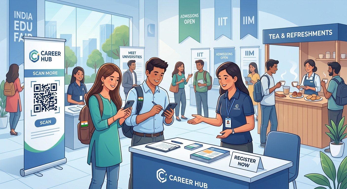
Pre-generated QR codes or unique IDs for faster check-in.
Dedicated counters and staff to help students quickly find their sessions or university tables.
Comfort-first event setup:
Providing tea, snacks, and water to create a welcoming environment, especially for students traveling from other parts of the city.
Comfortable seating areas where students could wait, network, or process information between sessions.
On-ground support and guidance:
Volunteers or staff assigned to help students navigate sessions, answer questions, and ensure they didn’t miss key interactions.
By aligning digital experiences, communication, and on-ground operations, we created a holistic journey that respected students’ time, energy, and aspirations.
Outcome
The transformation delivered tangible improvements across key metrics and stakeholder satisfaction:
Improved student registration experience satisfaction
Students reported that the registration felt clearer, more purposeful, and easier to complete. They appreciated knowing why their information was needed and how it would be used to personalize their event experience.Higher registration-to-attendance conversion
With better reminder flows, empathetic communication, and smoother on-ground logistics, a higher proportion of registered students actually attended the events. The funnel from “interested” to “present at venue” became significantly stronger.Increased university client satisfaction
Partner universities noticed fuller rooms, more engaged students, and better-prepared conversations, thanks to richer profiles collected at registration. This improved their perception of the client’s ability to deliver high-quality events.More repeat business and revenue
As universities saw consistent, well-executed events with strong student turnout, they were more inclined to return for future events and expand their collaboration. This translated into higher repeat bookings and incremental revenue for the client.
More Details
Redesigning the registration experience
We started by breaking down the existing long form into logical, themed sections such as “About You,” “Academic Background,” “Study Abroad Preferences,” and “Event Expectations.” Each section had a clear title and a short line explaining why those questions mattered. We introduced progress indicators so students always knew how many steps remained, reducing anxiety and perceived effort. We also optimized the experience for mobile users, simplifying input formats, shortening questions where possible, and rearranging fields for better usability on smaller screens.
Critically, we shifted the tone of the form. Instead of sounding bureaucratic, every part of the form spoke directly to the student’s benefit. For example, explanations like “Sharing your academic background helps us connect you with universities that match your profile” helped students understand that this information would directly lead to more relevant conversations on the day of the event. We added short, supportive micro-messages at key points - such as “This helps us suggest the right sessions for you” to encourage students to continue.
Social media and digital touchpoints
We didn’t rely on the form alone to build trust. We created supporting content on social platforms popular with the target audience, like Instagram and LinkedIn. Bite-sized visuals and posts communicated what students could expect from the event, what kind of universities would be present, and how sharing accurate information would lead to better matches, shorter queues, and more meaningful interactions during the event.
We also developed simple FAQs and “what to expect” content that addressed practical questions: dress code, documents to carry, languages spoken, session formats, and how their data would be used. This clarity reduced hesitation and reinforced the idea that the organization was on the students’ side. Over time, students began associating the registration process with guidance and support rather than paperwork.
Strengthening pre-event communication
To improve registration-to-attendance conversion, we designed a structured communication journey from registration until event day. Immediately after registering, students received a personalized confirmation that acknowledged their interest, reiterated event details, and shared a concise “how to prepare” checklist. Instead of one generic reminder, we put in place a thoughtful cadence of reminders across email, SMS, and messaging platforms, with each message having a distinct purpose reinforcing value, reminding logistics, and addressing last-minute concerns.
For students who indicated high interest in specific programs or universities, we recommended targeted reminder calls. These calls were not salesy; they focused on answering questions, confirming attendance, and reassuring students about logistics such as location, time, and expected duration. Additionally, social media was used to build momentum; countdown posts, behind-the-scenes content about setup, and highlights from previous events helped create anticipation and a sense of community.
Enhancing the on-ground experience
We recognized that all the improved communication in the world would fall short if the on-ground experience felt disorganized or uncomfortable. So, we worked with the client to refine their event operations. Venues were chosen with accessibility in mind, prioritizing central locations close to public transport and clear landmarks. Every confirmation and reminder message included map links and concise directions.
At the venue, we streamlined check-in. Students received QR codes or unique IDs during registration which could be quickly scanned at the entrance, significantly reducing queues. Dedicated staff greeted students, answered quick questions, and guided them to the relevant registration desks or university tables. This made the first few minutes of the event smooth and welcoming.
To further enhance comfort, especially in cities with hot weather and long travel times, we ensured that refreshments like tea, snacks, and water were easily accessible. Seating areas allowed students to rest, review materials, and prepare questions. The overall environment signaled that the event was designed with their comfort and success in mind, not just as a transactional fair.